
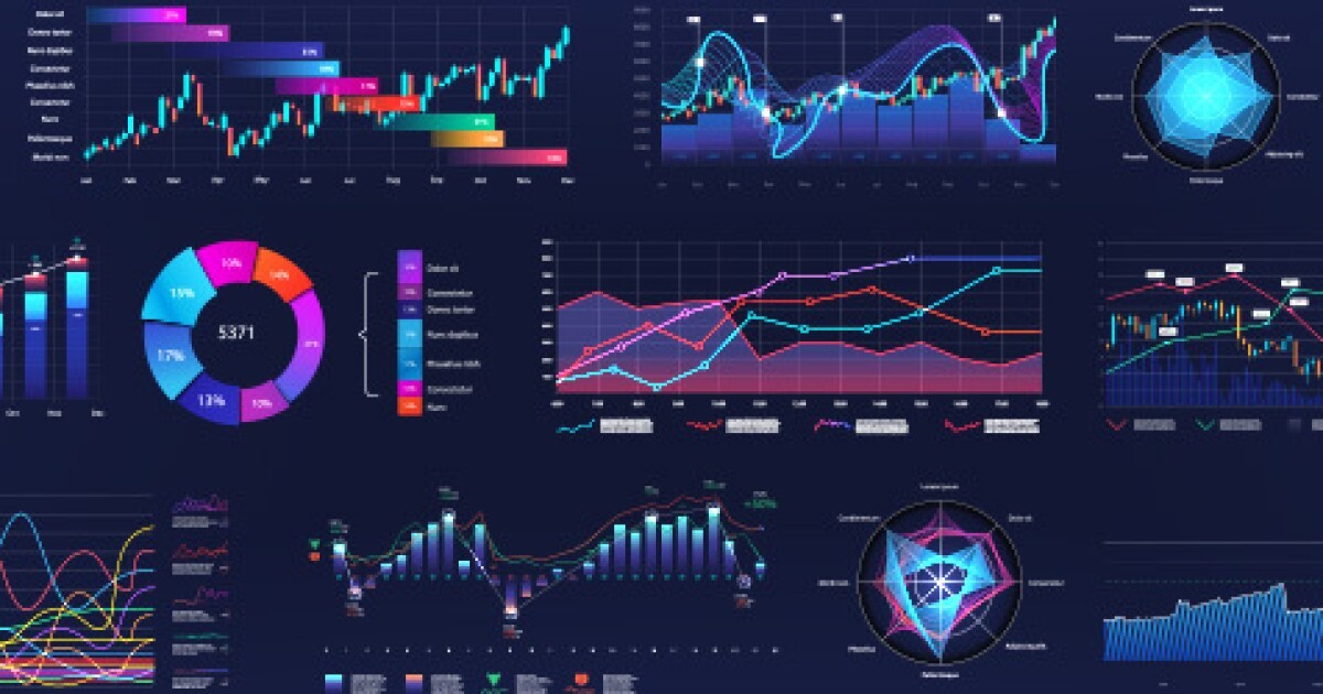
Financial visualization tools have become indispensable in the modern business landscape, offering a dynamic way to interpret complex data and make informed decisions. Rather than sifting through endless spreadsheets or static reports, these tools transform raw financial figures into interactive charts, graphs, and dashboards that reveal trends, anomalies, and opportunities at a glance. For professionals tasked with managing budgets, forecasting growth, or communicating performance to stakeholders, the ability to visualize financial data is not just a convenience—it’s a strategic advantage.
The real power of financial visualization lies in its ability to simplify complexity. Financial data is inherently dense, often involving multiple variables, time periods, and categories. Visualization tools help distill this information into digestible formats that highlight what matters most. For example, a CFO reviewing quarterly performance can use a dashboard to compare revenue streams across regions, track expense ratios, and monitor cash flow—all in one cohesive view. This immediate clarity enables faster decision-making and reduces the risk of overlooking critical insights buried in traditional reports.
Customization is another key benefit. Financial visualization tools allow users to tailor views based on specific goals or audiences. A sales manager might focus on revenue by product line, while an investor might want to see EBITDA trends over time. These tools support filters, drill-downs, and real-time updates, making it easy to explore data from multiple angles. This flexibility is especially valuable in meetings or presentations, where the ability to pivot and respond to questions with visual evidence can enhance credibility and engagement.
Integration with other systems further amplifies the utility of financial visualization. Most tools connect seamlessly with accounting software, ERP platforms, and cloud-based databases, ensuring that data is current and consistent. This eliminates the need for manual updates and reduces the risk of errors. For businesses operating across multiple departments or geographies, centralized dashboards provide a unified view of financial health, enabling cross-functional collaboration and strategic alignment. When everyone is working from the same visual framework, it’s easier to identify priorities and coordinate action.
Predictive analytics is another area where visualization tools shine. By layering historical data with forecasting models, businesses can visualize potential outcomes and assess risk. A finance team might use these tools to simulate the impact of a price change, a new investment, or a shift in market conditions. Seeing these scenarios play out visually helps stakeholders grasp the implications more intuitively than numbers alone ever could. It also fosters a proactive mindset, encouraging teams to plan for contingencies and seize opportunities before they fully materialize.
Communication is often the unsung hero of financial visualization. Numbers can be intimidating, especially for non-financial audiences. Visualization bridges that gap by turning data into stories. A well-designed chart can convey the trajectory of a business, the success of a campaign, or the urgency of a cost issue in seconds. This is particularly important when presenting to boards, clients, or employees who may not have a background in finance. By making data accessible and relatable, visualization tools help build consensus and drive action.
The rise of self-service analytics has made financial visualization more accessible than ever. Users no longer need to rely solely on data analysts or IT departments to generate reports. With intuitive interfaces and drag-and-drop functionality, even those with limited technical expertise can create meaningful visualizations. This democratization of data empowers teams to explore insights independently, fostering a culture of curiosity and accountability. It also frees up analysts to focus on deeper strategic work rather than routine reporting.
However, effective use of financial visualization tools requires more than just technical proficiency. It demands a thoughtful approach to design and storytelling. Choosing the right chart type, color scheme, and layout can significantly influence how data is interpreted. Overcomplicated visuals can confuse rather than clarify, while overly simplistic ones may miss important nuances. The goal is to strike a balance—presenting data in a way that is both accurate and engaging. This often involves iterating, testing, and seeking feedback to ensure that the visuals serve their intended purpose.
Security and governance are also important considerations. Financial data is sensitive, and visualization tools must support role-based access, encryption, and audit trails. Businesses should establish clear protocols around who can view, edit, and share dashboards, especially when dealing with confidential or regulatory information. Ensuring that visualizations are built on verified data sources and follow consistent definitions helps maintain integrity and trust across the organization.
Ultimately, financial visualization tools are not just about making data look good—they’re about making data work better. They transform static information into dynamic insight, enabling faster decisions, clearer communication, and more strategic planning. Whether you’re a startup founder tracking burn rate or a corporate controller managing global operations, the ability to visualize financial data effectively can elevate your impact and sharpen your focus. As these tools continue to evolve, their role in shaping financial intelligence will only grow, making them an essential part of any forward-thinking business toolkit.